Kant

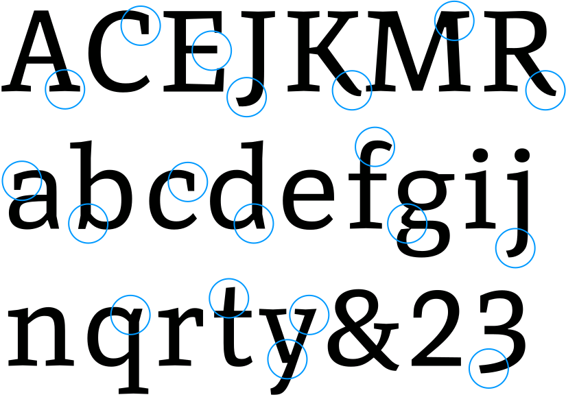
Kant is a confident serif with carefully crafted letterforms, balanced proportions and distinct, open characters. The contrast between thick and thin strokes is moderate, and the serifs are substantial and slightly notched. Together, these features give the typeface a firm texture and make it particularly reliable at small sizes and in demanding reading conditions.
At large sizes, its distinctive, crafted character comes to the foreground, revealing a typeface that is functional without feeling mechanical. Subtle calligraphic references appear throughout, for example in the terminals of K, R and y, and in the figures, where subtle ascenders and descenders recall the movement of handwriting. The capitals are slightly heavier than the lowercase, giving emphasis to the beginnings of words and helping to articulate the rhythm of a line.
Clarity is the guiding principle throughout the design. Dense or complex letterforms have been opened up to prevent them from filling in at small sizes, while unnecessary serifs have been omitted altogether. Nothing appears more elaborate than it needs to be. Every detail serves distinction, rhythm or readability. And yet Kant strikes a warm and human note: open, friendly and dependable. It combines the usefulness of a workhorse text face with the individuality and presence of a truly original design.
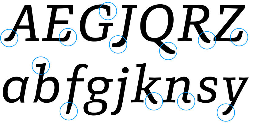
Kant Italic is not a slanted version of the roman but a typeface in its own right. It shares the weight and clarity of the upright styles, yet follows the movement of the writing hand. Several capitals, such as A, E, J, K, L, R and Z, carry calligraphic touches that give the italic a livelier voice. The f reaches below the baseline, as it does in handwriting, and h, m and n carry half serifs on the right only, leading the eye in the direction of reading. An alternative single-storey g is available for a more fluid, handwritten feel. The result is an italic that sets off emphasis clearly within running text and holds its own in longer passages.
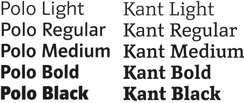
Georg Salden originally designed Kant as a serif companion to his Polo, one of the most influential humanist sans serifs. Both typefaces are built on the same underlying structure and share key proportions and characteristic letterforms, so their kinship is immediately apparent.
Yet the serif does not follow this structure slavishly. Proportions, stroke modelling, contrast and transitions have been adjusted wherever necessary to suit the logic of a serif typeface. The serifs are not an afterthought added to the sans, but part of an independent system of forms developed from it. The result is a type family whose members clearly belong together while taking on different typographic tasks. Sans and serif speak the same formal language, but place different accents in rhythm, texture and expression.

Kant Expert fonts come with several sets of figures. The default figures are of equal height but slightly shorter than the capitals, so they sit comfortably in running text, and they have small ascenders and descenders (top centre). Expert fonts also include true lining figures at cap height and old-style figures with full ascenders and descenders (right). In addition, tabular versions of both lining and old-style figures are available and can be selected via OpenType features.

The upright styles of Kant Expert fonts also include true small caps, capitals drawn at the height of the lowercase, together with matching figures.

All Expert styles include an alternative single-storey g, which can be selected via a stylistic set. The italics use the single-storey a by default; an alternative double-storey a is also available via OpenType features.
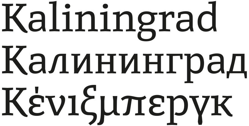
Kant Expert supports not only an extended Latin character set, but also Cyrillic and Greek.
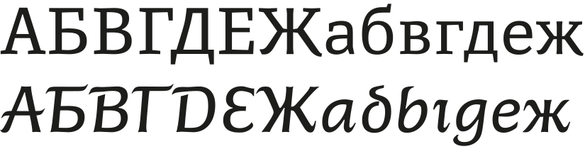
The Cyrillic italics deserve special mention. They do not simply follow the Latin italics, but have a distinctly calligraphic character throughout, from the lowercase to the capitals. Rooted in the tradition of Cyrillic handwriting, they go further than most Cyrillic italics and give the script a voice of its own.
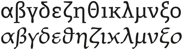
Greek letterforms are rooted in handwriting, a tradition that shaped Greek printing types from the very beginning. Unlike Latin, Greek typography never strictly separated upright from italic styles. In many modern Greek typefaces, the upright styles align more closely with Latin, while the italics stay closer to handwriting. Kant follows this approach: its Greek upright sits calmly alongside the Latin, while its italic has a fluent, calligraphic voice of its own.